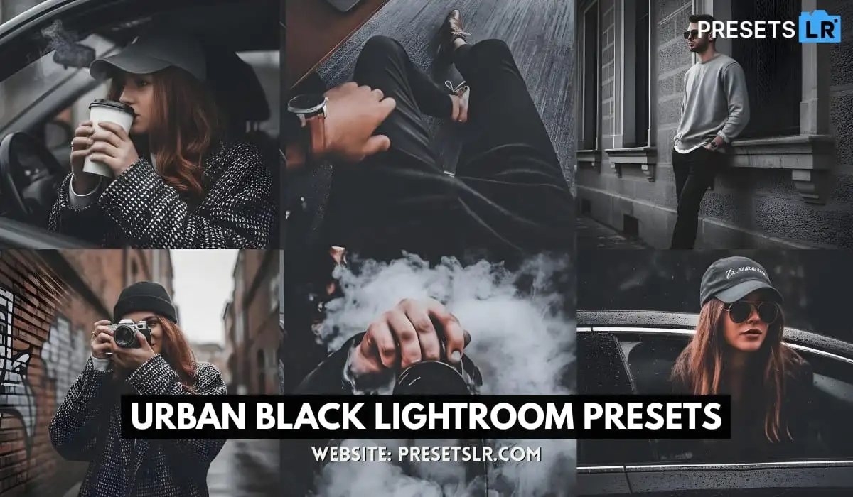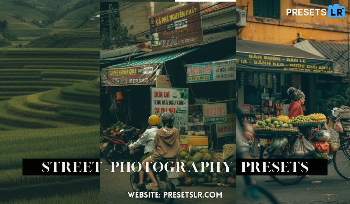
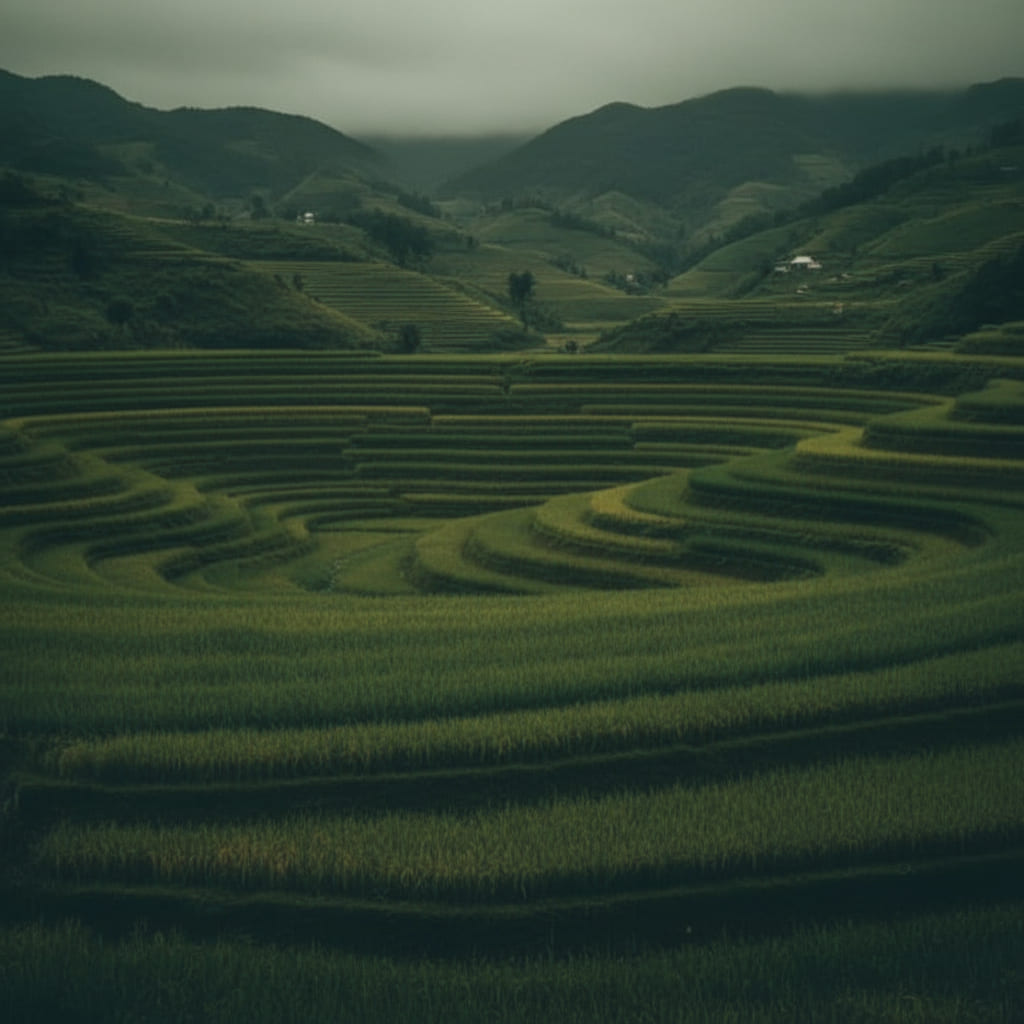
Edit Street photo in lightroom best lightroom preset for street photography
Edit Street Photos in Lightroom (Step-by-Step Guide)
Best Lightroom Preset & Workflow for Street Photography
Street photography is all about capturing raw, unfiltered moments—but the real storytelling happens in the edit. The way you shape light, color, and mood inside Lightroom determines how your audience feels about that moment.
Step 1: Basic Adjustments
Always begin in the Basic Panel:
Increase Exposure (slightly brighten image)
Lift Shadows (recover detail)
Reduce Highlights (protect bright areas)
Add a touch of Contrast
Slightly increase Temperature (for warmth)
💡 Even if you plan to add cool tones later, warming the base image helps balance skin tones and light sources.
Tone Curve for Depth & Mood
The tone curve helps fine-tune contrast and create a cinematic feel.
- My workflow:
Add 3 control points
Slightly lower shadows
Raise midtones
Increase highlights
Lift blacks (for faded look)
Lower whites (to soften highlights)
👉 Result: A subtle, rich, moody contrast without overdoing it.
Color Mixer (HSL) – The Game Changer
This is where your image truly comes to life.
Hue Adjustments:
Shift Yellows → Orange (warmer light)
Make Blues & Aquas cooler (city feel)
Slightly push Oranges toward red (enhance warmth)
Get the Exact Preset Used in This Edit
If you want your street photos to look like this without spending hours editing…
👉 Click below to download my Lightroom preset:
👉 [Download Street Photography Preset]
This preset will help you:
Instantly create a cinematic look
Save time on editing Editing Cinimatic in a sec for use this street photography lightroom preset
Maintain consistent color grading
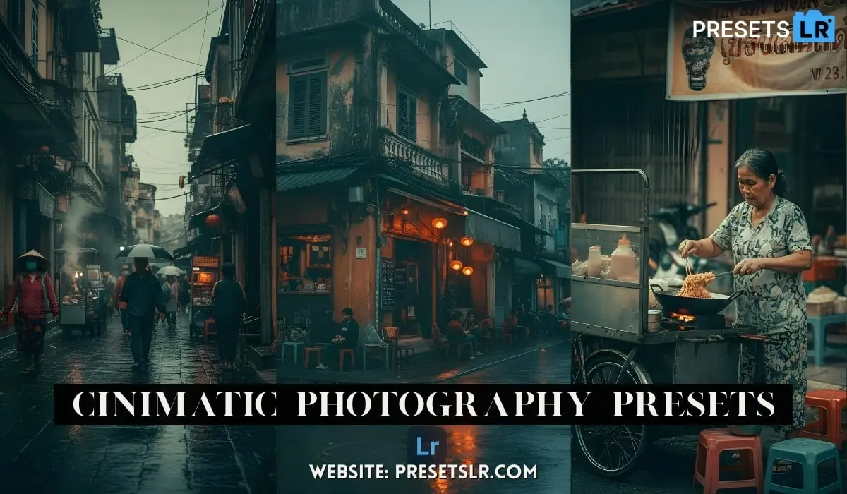
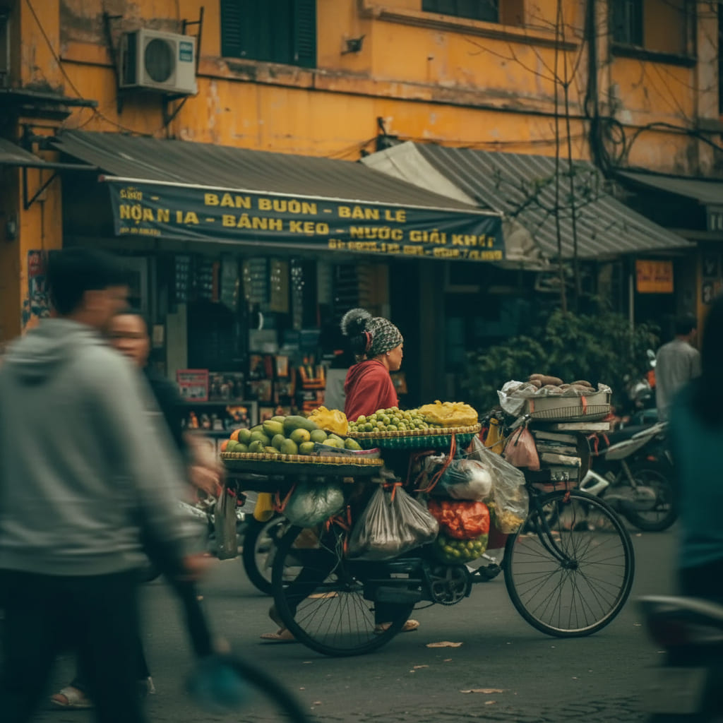
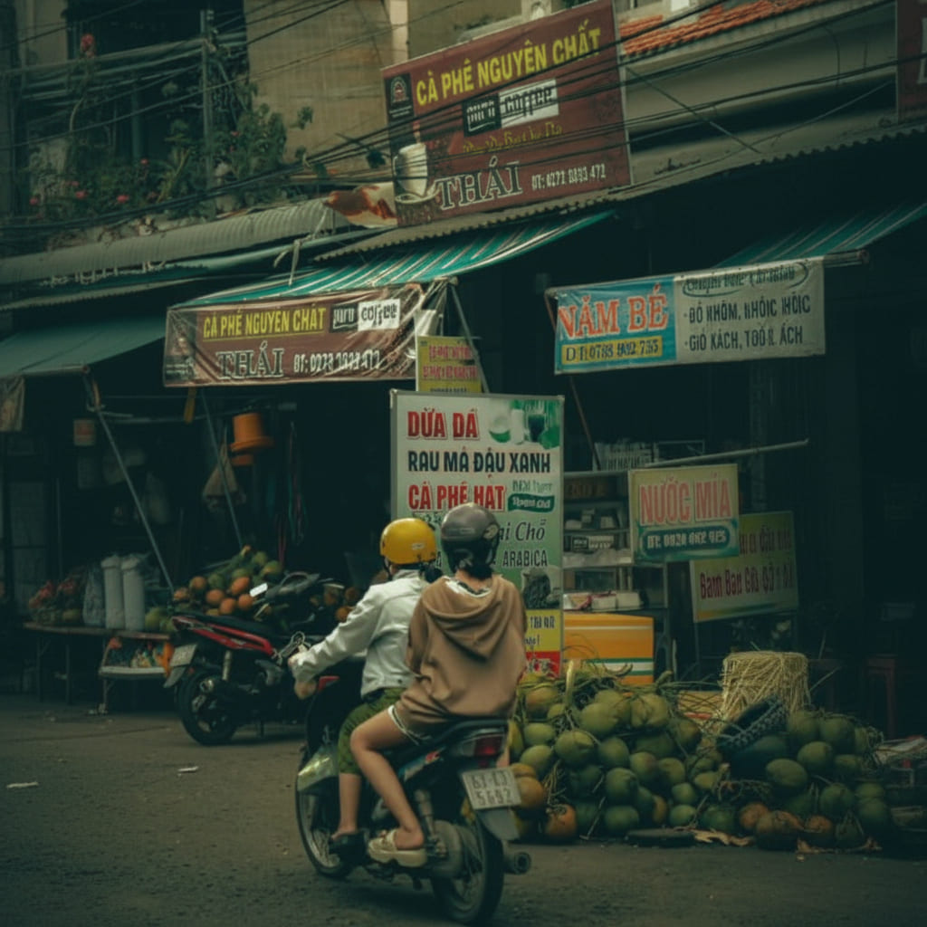
I shot this pretty early morning street photo and i will apply to cinematic colour effect street preset on this RAW street photo This Photo Edit in a sec. Uh so, all like the shops around the this like I think he was selling
dumplings, this dumpling seller right here. Um all of these shops are closed. There’s no lights on anywhere else, um and everything’s pretty much like dark and dreary and and sort of killed off, except for this guy’s stall. And um it’s nice and warm, which is really good, which is usually not really the color we might associate, you know, big mega cities with. So, the idea for this edit um is to make our sort of dumpling shop here stand out as like a nice warm beacon of the city, if you will. I don’t
want to go too crazy in-depth into things, but by the way, I want to make this sort of stand out like quite nice and warm, and then make everything around our shop quite cold. And to sort of add to this shot as well, we’ve got quite a lot of people standing around um you know, the the front entrance here, which is a really cool vibe as well. You know, we’ve got a lot of people coming into the frame, uh all the more sort of helping us tell the exact story that I just laid out with this, you know, warm
bit of the city coming to life nice and early in the morning. Now, there are a few things I don’t like about this shot. The first thing is this bike here that’s been parked. This didn’t move for a long time in the scene, so unfortunately, uh that’s just there. We might be able to remove that later with the AI remove, but we’ll see how we go. And then we’ve also got these people walking over here. They don’t really add all that much to the shot at all, and there was a consistent sort of
flow of people coming down this little street here. So, just having these two people here were uh was was actually kind of the best situation I had while taking this photo. So, we could also look at removing them, but we are going to do all of the editing first. Anyway, with all of that out of the way, let’s now move in to the crop. So, we’re going to open up the crop tool here, and we are going to crop this image to 16 by 9. I find that the 16 by 9 aspect ratio is a very nice cinematic-looking
aspect ratio crop, uh and it’s also not too tight. Another crop that I absolutely love that could work on this shot is the 2.35 by 1. This is an absolute staple, but I feel like it cuts just a little bit too much out of our frame, which is definitely not what we are after. Okay, so let’s center our dumpling shot in the dumpling shop in the middle of the shot, uh in the middle of our frame right there. I would say that is looking pretty good, and now we can get on to the edit. So, let’s
first kick things off with our basic tab by correcting our image. I always recommend pretty much everyone to start that all of their edits out correcting their shot first here inside of the basic tab. So, I would say, and especially looking at our histogram up here, things are pretty dark. So, let’s look at brightening things up simply just by increasing the exposure a little bit, increasing the shadows a touch as well, maybe reducing the highlights ever so slightly. Let’s add a little bit of
contrast, but not too too much, and then let’s also look at warming up this shot ever so slightly as well. I know that that warms up everything in our shot. Uh however, we will be able to do a whole lot of masking and color grading later to make sure that everything else is nice and cool. So, with that out of the way, now we can see exactly what’s going on in our shot. This image is still quite dark, but that’s okay. I sort of want to lean into that dark and moodier feeling, as it’s just going to add so
much to the feeling of the shot once our edit is complete. Now, to round out the basic tab, let’s make our way down to presence, where we are just going to slightly drop the clarity just a little bit, and we also might ooh, we might increase the dehaze just a touch. Just like that. We’re going to leave vibrance and saturation as is for now, and we are then going to head into the tone curve. This is where we get to fine-tune our exposure and contrast levels, and get to set a much sort of more intentional look
and feeling on our shot, especially compared to the basic tab where we just finished. So, what I’m going to do is add three points to our tone curve. This is a very classic tone curve workflow for me, and what we’re going to do is first start by adjusting our shadows point right here. We’re just going to move that down ever so slightly. This is just going to reduce the shadows a little bit. We’re then going to look at increasing the midtones a touch and increasing the highlights a touch. I’m
just keeping an eye on this sort of like menu board right here. I know that we’ll be able to recover that, especially when we’re masking a little later on, but I don’t want to push that and blow that out all too much, but we do want to increase our highlights a little bit there. And then we are going to come down to the blacks point and just raise up the blacks point a little bit, and then we’re also going to drop the whites point a little bit as well, which fades out the dark and really bright parts of
our shot, and I’m a huge fan of how that feels. Now, even though the tone curve looks super super subtle right now, and arguably it is because the image is already quite dark, I don’t want to add a whole lot of contrast into it. We could just click the little tone curve eye right there to see a before and after. So, this is before, and then this is after. It just adds a little bit more of a richer, deeper feeling, which is definitely a look and feel I want to be going for with this edit. Whoa, just a
quick one for you. If you want to do you and your Lightroom editing workflow a huge favor, head down to the first link in the description and check out my master collection of Lightroom presets. These are the presets I have used for the last 6 years. Of course, I’ve developed and updated them over those years, and tens of thousands of other photographers have used and loved them as well. So, if you want to speed up your editing workflow and make sure you’re not doing everything manually
every single time, head down to the first link in the description. I promise you won’t regret it. Anyway, back to the Blog. All right, so making our way into the color mixer, this is going to have a really really big effect on our shot, as this is where we get to dial in exactly how all of our colors look and how they are represented in our shot as well. So, let’s first kick things off with the hue. I am going to make my way over to the yellow hue slider and just make them a little bit more orange to help sell
that warmer feel inside of our dumpling here. It’d be hilarious, by the way, if this wasn’t a dumpling shop. I didn’t buy anything here, and from my memory, I have no idea what they were selling, but if we zoom in close enough, I am pretty sure they are dumplings, but like I said, I could be wrong. So, anyway, let’s make those yellows a little bit warmer, and then let’s also make the greens a little bit warmer as well. I don’t really see too many greens in this shot. Maybe we’ve got some right here.
This uh sort of like awning would definitely fall under the aquas, and then even this plant right here is probably on the yellow side of things. If we move that around a touch, yeah, we’ve got a little bit of green in there. So, let’s make that just a little bit mm actually, where else are we affecting? Maybe let’s make them a little bit cooler to kind of keep the edges of our image a little bit colder, as really we only want this dumpling shop to be the warm sort of thing in our shot. So, let’s now move on
to the aquas, making them a little bit bluer and a little bit colder. Let’s make our blues just a little bit more aqua, just ever so slightly. Literally, minus four is all we need. Maybe with the oranges as well, since this isn’t like a up-close portrait of anyone, we can sort of get away with somewhat not 100% accurate skin tones. We don’t want to, you know, make them red, for example. However, just making our skin tones and the oranges in our shot a little bit more red does help sell that
warmer feeling. So, just adjusting the oranges a little bit there, still treading quite lightly, um definitely looks nice. And then with the purples, let’s make these over onto the blue side quite heavily, and then with the magentas, I would say we’ll probably move those over to the right onto the red side. Now, when it comes to saturation, we’re probably not going to play around with the saturation all that much. If we look at reducing or increasing ooh, huge fan of this, actually. Let’s maybe increase the
oranges a touch, as it definitely brings out quite a lot of life, especially in the shop here and then in the banner up the top here. I know this is probably the exact same shop, but we will look at killing off the coloring in this banner here to make sure that just the shop front stands out a little later on. And then when it comes to the yellows, let’s also look at increasing the saturation just a little bit. And then everything else, I’m going to leave as is. We could probably come down here to the luminance
and just reduce the yellow luminance a little bit, and as you can see, as we do that, we bring back so much detail in our menu board there. If we sort of reset that, yeah, you can see that’s huge, and we didn’t even have to use masking. So, just like that, we’re going to drop the yellow luminance a touch, and just like that, our color mixer workflow is probably wrapped up. Let’s now get a quick before and after on our shot. Things definitely look more balanced, and they are definitely moving
in the direction that I want them to. Let’s now make our way into the color grading tool, which where we are probably going to be adding blue into the highlights, midtones, and shadows. And that is because we want to make sure that every other part of our image is blue. And you can see up here, we’ve got bright highlights, and we have a super dark shadows as well. So, let’s start adding some blue tones into all of these areas of our shot. We’re just going to add a little bit of blue into the
shadows, not too too much. I’d say a saturation of 20 there is looking good. Let’s now move on to the midtones. Let’s add a nice hint of blue in there, not too much. Saturation 10 looks good to me. And then, with the highlights as well, let’s add a good amount of blue in there, too. So, having a look at a quick before and after just on the color grading, you can see that this has transformed our image quite a lot, and added a lot of that mood, emotion, and sort of depth in our image, made things
a lot cooler without removing all that much warmth, at least from our dumpling shop, which is exactly the look that we are after. Now, moving into detail, I shot this at 100 ISO, but I am still going to just slightly denoise our image. One, because it literally takes no time or effort to do, so I’m happy to just click a button and let Lightroom do the heavy lifting. And two, I want to make sure this image is looking pretty clean, but I don’t want it to look too soft. So, if we now zoom in to
sort of an area where we have bright areas and dark areas, you can see that just by turning off denoise, you can see that we’ve lost a little bit of texture, which is fine. But let’s reduce this to about 20, and I would say now we will have no noise in our shadows, which is great, but we’re still not losing any texture, so I’m pretty happy with that. Let’s now have a look at sharpening. We’re going to leave the sharpening at 40, as I don’t like to over sharpen my images whatsoever. However, we are going
to be increasing our masking very considerably. We want to make sure that only the parts of our image that should be sharpened are going to be sharpened. So, we’re going to probably increase that to about 95. I’d say I’m pretty happy with how that is looking. And we are going to skip over manual noise reduction. We are going to enable profile corrections and chromatic aberration, as these are just stock standard things to do. They remove the warping from your lenses, which can be very important, especially when I’m
shooting with a lens like the 20 mil F 1.8. And then, removing chromatic aberration, this lens doesn’t really suffer from chromatic aberration. However, it’s always just kind of like a good housekeeping thing to sort of tick on. And once again, it takes no time to do. So, let’s skip over the transform tool and the lens blur tool, and we’re also going to skip over the effects tool, and finally make our way down into calibration, which where we are going to have the final sort of impact on our
colors before diving into the tool that’s going to have the biggest effect on our shot. So, let’s first kick things off with the shadows. What I’m going to do here is move things over to the left, move things over to the right. And I would say I don’t really like either side, so I’m actually just going to leave this set to zero. Let’s now move our way into the red primary. And once again, we’re going to do the same thing. Over to the right, over to the left. Let’s move that just over to the left a
little bit, over to the left, over to the right. Ooh, let’s just look at increasing the saturation a touch there. And then, green primary, same thing here. I would say over to the right just a touch. Saturation, left and right. Cool, that’s looking pretty good. And then, finally, the blue primary, which almost always moves over to the left, at least in my edits, and the saturation of it as well. Let’s probably just leave that at zero. Cool. So, with that all out of the way, that is our basic
corrections done, and all of our coloring workflow done as well. And as you can see, our before and after, this shot is looking way nicer, and it’s getting a lot closer to how I described wanting the shot at the start of this Blog. But we are now going to dive into masking, which is by far going to have the biggest impact on our shot. So, let’s open up the masking tool here, and let’s kick things off with a custom vignette, a radial gradient over the entirety of our shot, just like that.
Let’s position it to make sure that our dumpling shop is not going to get affected by any of this at all. Let’s then invert it over here on the right-hand side, and then let’s look at dropping the exposure quite significantly, actually. This is going to really help our dumpling shop stand out from our image, which is great. And just keep in mind that the masking workflow can and usually does take quite a lot of time to get right. But with my AI editing system for Lightroom, you can pretty much automate the entire
workflow, which is wild. I’m not going to use those tools today. However, you can see them over here in the preset tab, and if we come down here, we’ve already got them open as well. You can see I’ve got my AI toolkit utility, subject, and base edits. You can check these out in the first link in the description. They make masking an absolute breeze. If you want to learn more about those, head down to the link. But like I said, we’re going to close up the preset tab, and we are going to do
everything manually. So, the first mask is now out of the way, so let’s now add a linear gradient to this shot as well. We’re going to now darken the bottom of our shot. This just helps add quite a lot of depth into our image, which is a really nice look that I love to add. And now, all we’re pretty much going to do is go through and remove things we don’t like with masking in regards to colors and light, and then make everything else apart from our dumpling shop stand out, which is great. So, let’s add a radial Gradient over our dumpling shop here, just like that. Let’s expand it just a little bit more, and then let’s look at just increasing the temperature slightly. This is obviously going to warm up our dumpling shop, which is great. And let’s then also look at increasing the exposure and the contrast really help it pop. Let’s then add another radial gradient over the image here. And what we’re going to do this time is we are going to Give me the little dots. We are going to intersect
this mask with a color range, and we’re going to click on that orange just there. We’re then going to scroll up here and make sure that it’s really all we’re selecting with the refine tool, just like that. And now we can come down here and look at desaturating this, just like I mentioned earlier on in this Blog. And then we’re going to do the same thing over here with this little sign right there. Once again, we’re going to intersect the mask with a color range. This time, Lightroom showed me
the dots, which was great. And then we’re going to refine our mask, our selection. I’m going to press O, which is the shortcut to remove the masking overlay, and then we can look at just desaturating that as well. Looking pretty good to me. And then we’re going to come in here with another linear gradient, and we are going to come up to exposure, and we are going to, just like that, we’re going to kill off the exposure quite significantly. However, I’ve just noticed up here, we have a
little bit of light creeping in from like a reflection of a building. So, what I want to do here is just crop in a little bit to remove that. Ah, I’ve just got a slither in there. Let’s crop that just a little bit more. Okay, that’s looking pretty good to me. Make sure that our dumpling shop is still centered in our image. And just like that, a quick before and after, I would pretty much say we are done except for one last thing, and that is the remove tool, which is controversial. Can sometimes be
controversial, and can sometimes not be. So, let’s have a look at the two pain points that we spoke about earlier. We’ve got these people over here, which we could probably remove quite easily. Just like that. Oh, make sure his pants are selected there. And then we have got the bike, which we can come in here and sort of paint out just like that. Let’s it remove and see what the shot looks like. Honestly, I’m not really bothered if the bike stays. Yes, it is a bit of an eyesore. Yes, it does distract and
take away from our shot, which are all things that we don’t really want. Wow, Lightroom is incredibly good at removing things. My goodness. Okay. Uh, if we scroll through these options, you can see, okay, let’s we’re starting over here first. I don’t want to add any text. I would say probably number two looks the best. And then over here, I mean, I wouldn’t even notice something’s gone. Uh, number two and number three. Oh, I would say maybe number two. Something weird is going on here. That’s probably
my fault. Mightn’t If we have a Yeah, I didn’t need to select that area. So, what we can do, actually, is Oh, hit cancel there. We can delete this one, and then I can come in here with a more refined selection, just like that, making sure I don’t get any of our little dumpling shop in there whatsoever. And then we can look at removing that. Now, of course, this is a step that is up to you. If you want to play around and look at removing things from your shot, then by all means, power
to you. If not, it’s totally up to you as well if you want to leave the scene as is. But for this shot, wow, that’s looking really good. Let’s just add one last mask, and then we can sort of decide if we want to keep this or not. So, just by simply sort of reducing the exposure there, it sort of helps it blend in just a little bit more. And you know what? I’m pretty happy with how that looks. A quick before and after on our shot, I would say that’s our edit complete. And there we go. That is
exactly how I edit my street photos inside of Lightroom from start to finish, also, of course, letting you know every decision and the thought behind every decision every step of the way. Anyway, guys, that is going to wrap up today’s Blog Article. If you want, go ahead and do yourself a favor by checking out my master collection or my AI editing. And guys, if you want to continue learning about photography and photo editing, you can check My Latest Blog Thank You Guys
Download My Street Photography Lightroom Preset
Want to achieve this exact cinematic street look in seconds?
👉 Download my Street Photography Lightroom Preset here:
[Download Preset]
This preset is designed to:
Add warm highlights and cool shadows
Enhance contrast and depth
Create a cinematic street photography vibe