How to Create DARK & MOODY Style Photos in Lightroom
I’m gonna break down how to do this really cool-looking dark and moody photo effect that you’ve probably seen around on Instagram. It’s pretty popular right now, so we’re gonna go into Lightroom, and we’re gonna break it down step by step so you can recreate this effect with just about any photo. So, let’s get right into it!
Alright, so we have Lightroom opened up. Here is the original image that I started with. And as you can see, let’s take a look at my settings:
Fairly standard ISO 320 — I kept it pretty low so I wouldn’t get a whole bunch of noise in my shot.
I shot at 24 millimeters on my 24-105mm lens.
I closed it down because I really wanted that deep depth of field with f/11.
I shot at about a half-second long exposure. So, my shutter speed was a half a second.
So, let’s start breaking down how I recreated this effect.
For my color temperature, it’s fairly warm. I wanted my greens to really pop out, and I wanted this dark brown-orange boardwalk to really pop out, so I kept the temperature pretty warm. And my tint, you can see, is kind of right down the middle.
I like that green in the foliage, but you don’t want to overdo it with your greens. So, to start out, I turn my exposure down just a little bit, because as you can see, it’s a dark and moody effect, so that already kind of gets us that start to where we’re going.
I usually start by turning down my exposure usually about one stop. You can also do this by shooting your photo just a stop underexposed. I’ll also bring up my contrast just a little bit.
All of these settings will obviously be adjustable depending on your scene and how you shot it. This is just kind of a quick template to throw on your photo, but you’ll have to adjust everything according to your scene. Not all these settings are going to work perfectly with every photo.
Another thing I like to use is to play with these shadows and highlights. Be careful — you can get too heavy-handed if you do too much with these. A little goes a long way. But I like to turn down my shadows a little bit, especially if it’s wet outside and you have the sun or the sky or any sort of light reflecting off the leaves, just to bring some of that saturation back into your leaves.
Same thing with the shadows — a little goes a long way. But I’m gonna bump these up a little bit, just so I can get some of that detail back. That’s a little bit much — maybe plus 10 or 20 — so I can just get a little bit of that detail back in the shadows.
Then, same thing with my whites — I will pump up my whites just a little bit and turn down my blacks just a little bit.
Now, a really cool tip that I learned: If you want Lightroom to automatically adjust your white levels and black levels, you can hold Shift and double-click the blacks, and also hold Shift and double-click the white slider, and then Lightroom will automatically adjust it for you.
Now, in this case, that’s about where I want my whites, but I am going to drag my black levels down just a little bit to really crush some of those black shadows in there for this effect.
Now, I also want to take my Clarity slider — this is another slider I usually tell people not to mess with too much — but I’m gonna take it and I’m gonna drag it down just a little bit, right there to about negative 20, just to give it that little bit of a glowy, dreamy feel.
I’m gonna leave the vibrance alone, but I’m gonna take my saturation, and I’m gonna turn the total saturation of this image down to, I don’t know, around -40. That feels about right. I think I’ll leave it right there.
Now, to our Tone Curve — I absolutely love the ability to play with the curves in Lightroom. So, what I’m going to start by doing is dragging my shadows up a little bit. This is called lifting the shadows, when you take this point here and you start lifting your shadow level. You’ll see it starts to gray out your shadows just a little bit.
I’ll also take another point and drop that point right here in the middle to bring down my midtones. I’m gonna take another point and drag up my highlights just a little bit to make them pop, and then I’ll take another point here down by the shadows and drop it just a little bit.
And like I said before, you can take these points and adjust them towards your image, but you can see we’ve already made a giant leap toward where we’re going. The Tone Curve is super powerful, and you can play with it and just make little tweaks to your image to take it where you want to go.
The next box we have here is the Hue, Saturation, and Luminance (HSL) panel — another section just to make minor adjustments to your image.
I’m gonna go through here and turn down my red saturation a little bit. There’s not too much red in this.
I’m gonna go over to saturation — we’ll start with that. I’m gonna turn reds down just a little bit. I’m going to turn my oranges down just a tiny bit, but I will take my yellows and saturate them a little bit more just to bring out a little bit of this boardwalk and the yellows in the trees.
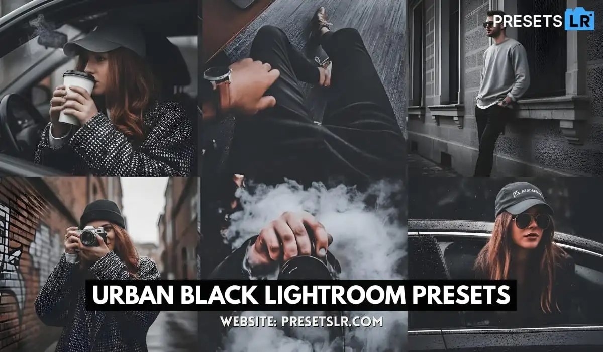
Download Free Dark Moody Lightroom Presets-Download
I’m actually going to take the orange and pump it up just a tiny bit — actually, I’ll leave that at about zero. I’ll take my greens, and this is again another crucial part of this effect, especially with forests. I’m going to take my greens and desaturate about half, and then I’m going to leave the rest of the colors and saturations right where they are.
Now, we’ll open up this Luminance tab. Another cool thing — you can individually adjust the luminance of each of these colors right here.
So I’ll leave red at zero. I’ll take my orange and pump it up just a little bit. As you can see, that nice warm orange-brown boardwalk — I’m making those textures pop out a little bit.
I’m going to do the exact same thing with my yellows — pump those up a little bit so I’m getting that little bit of yellow in the trees and the highlights.
Take my orange, move it up just a little bit more so I can capture some more detail in that orange boardwalk. I really love it.
I’m also going to take my greens and bump up their luminance just a little bit. I want to see that detail in those leaves that I wasn’t quite getting with my highlight and shadow sliders.
I’m gonna do the same thing with the aquas — there’s just a little bit of blue in there, so I’ll pump it up. And same with blue, just a tiny bit, because there are some blues in there whether your eye sees them or not.
Hue/Saturation/Luminance — that looks great. Let’s move on to Split Toning, another crucial part of this effect.
For Split Toning, I’m going to mess with the highlights a little bit. I’m gonna make my highlights kind of a greenish tint, just a little bit of green in the highlights. That’s going to add some greenish tones into the highlights reflecting off these leaves.
Then for my shadows, I want to make them kind of a purpley-blue — a little more purple, I guess, than blue. Just add a little bit — again, a little goes a long way with split toning.
Then, for Detail, I’ll add just a little bit of sharpening, and a tiny bit of luminance noise reduction, and that looks great so far.
Next, I love this Post-Crop Vignette tool. I keep it on Highlight Priority. We’re just going to add a little bit of a vignette here, bring that in so you can see your eye really starts to focus toward the end of this path. I love how the light comes through these trees and hits the end of that path right there. Everything in here is just a leading line for your eye toward the end of the path.
So, I added just a little bit of vignette — that’s a little bit too much — crank it back a little bit. Take my Midpoint slider, and what this slider does is move your whole vignette effect toward the center. I’m going to leave Roundness at zero, but I am really going to feather this to about 100, then pull back on the effect just a little bit.
Then you can see these little boxes right here. I can turn the effect on and off. That looks great so far.
I’m also going to go down to my Dehaze effect, and I’m gonna turn that up just a little bit. I like this Dehaze slider — it’s kind of like a midtone contrast slider — really makes some of the small details pop out.
And one more absolutely crucial part of this effect in Lightroom is to make your own Masks. I love using these Gradient Filter Masks. I can just take them and slide them wherever I want to make adjustments to certain sections of the image.
So, what I did for my Gradient Mask is I brought down the temperature a whole lot. I really wanted to make those greens over on the side a lot cooler, and I also made them just a little bit more green with the tint.
I also brought up the exposure just a little bit so you can see some more details in there. I thought the detail looked great over here, so I just wanted to affect the detail in this part of the image.
I also wanted to bring up my contrast just a little bit, bring down my highlights because the exposure kind of blew out some of these highlights and tiny details that I didn’t want to lose.
I also wanted to bring up the shadows just a little bit, then bring up my whites just a tiny bit, and bring down my blacks just a little.
Now, when you start seeing too much detail, that’s when you can go in and turn down your clarity a little bit. That adds just that little bit of glow to the highlights, which I love.
Then turn down my saturation a little bit here so I’m not overdoing it with the greens. That looks great.
Then I’ll turn up the Dehaze just a little bit. I think that looks really good and brought out a lot of the detail. Let’s turn this on and off and see what that looks like. Cool down some of these warmer areas back here in the foliage — that looks good.
I’m gonna do the same thing — I’m going to duplicate this gradient mask over here and do the same thing where I cool it down, bring up the exposure just a tiny bit so I bring up that rail exposure, add a little bit of contrast, turn down the highlights slightly, turn up the shadows to get those shadows back in there, figure out my white values, turn down the clarity, turn up that Dehaze just a little bit to get some of those details, and then turn down the saturation just a tiny bit.
I’m gonna go back, and as you can see, it’s a little bit darker on this side, so I want to turn up the exposure on the left-hand side of the image. I don’t want to do it too much. Turn down these shadows a little bit, and I think that looks great so far.
Alright, so that is it for this effect! As you can see — and as I said multiple times — you just make little adjustments based on your own image, so everything is absolutely customized.
That’s what’s so awesome about Lightroom. You can go in and make so many tiny little tweaks, and there’s an infinite way to adjust and edit your photo.
So this is our final image. Then I’m gonna click over here — here was the final image that I was going to recreate. So we got pretty darn close! Every time I do this, I just kind of eyeball it and see where I get.
So, this is where we got in this image, and I think it turned out awesome!
So, that is it for this episode. Make sure you guys comment down below — I want to know what you guys think, and I want to know what you guys want to see.
Do you want to see more photo edits just like this? Drop some suggestions, and I’ll be sure to do it.